However, with so many different materials and synonymous messages to choose from, and a variety of regulations to keep track of, sign selection can be a complex process. In order to communicate comprehensive messages to your employees, customers and public, it is important to understand the key components of sign selection.
Here are five aspects to consider when selecting safety signs for your facility:
1. Materials
Choosing a material for your safety sign may not seem as significant as the message or regulatory compliance of the sign. But it’s important to remember that different materials are equipped for different environments and applications. If you don’t select the proper material, you could end up having to replace the sign more frequently than needed.
Popular materials
Plastic: Plastic is a cost-effective, lightweight and durable material for safety signs. Plastic signs conform to well-curved surfaces and are an option for indoor and outdoor installation. These signs can withstand harsh outdoor conditions for one to two years. This material is commonly used for directional signage.
Aluminum: Aluminum signs are ideal for both indoor and outdoor use. Offering excellent chemical resistance and abrasion resistance, aluminum signs can withstand tough weather conditions such as wind, rain, sunlight and high temperatures (up to 100°F) for up to eight years. This material is commonly used for parking signs, building signs and informational signs.
Fiberglass: The most durable material for signs, fiberglass is guaranteed not to chip, fade, rust, shatter or peel for up to 15 years. This material also has excellent chemical and abrasion resistance.
Self-sticking polyester and vinyl: Self-sticking signs can be used indoors and outdoors and are extremely easy to mount. They offer an average outdoor durability of up to five years and have a fair chemical and abrasion resistance.
2. Message clarity
ANSI Z535 and OSHA specify that safety signs must indicate and define specific hazards that, without identification, may lead to accidental injury to workers, customers or the general public. Messages such as “Warning” and “Caution” may seem synonymous, but they actually deliver very different messages. Sign headers are based on the sign application.
Sign headers
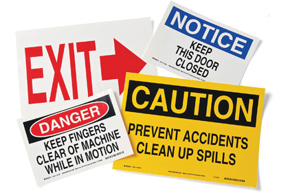
Danger: Use this message to mark hazardous situations with a high probability of death or serious injury. Do not use for property damage unless personal injury risk is present. The word “Danger” should be limited to the most extreme situations. Red is used to identify “Danger” signs.
Warning: Use this message to mark hazardous situations with some probability of death or serious injury. Do not use for property damage unless personal injury risk is present. Orange is used to identify “Warning” signs.
Caution: Use this message to warn of hazardous situations which may result in minor or moderate injury. Do not use for situations where there is a possibility of death or severe injury. Caution signs without a safety alert symbol may be used to alert against unsafe practices that can result in property damage only. Yellow is used to identify “Caution” signs.
Notice: Use this message to state company policy as the message relates directly or indirectly to the safety of employees or protection of property. Do not use for hazardous situations where there is a possibility of death or severe injury. Blue is used to identify “Notice” signs.
Emergency: Use for indicating general instructions relative to safe work practices, procedural reminders and safety equipment locations. Green is used to identify “Emergency” signs.
3. Styles and regulations
There are different safety sign styles to choose from, depending on the application and message of your sign. The majority of signs needs to meet OSHA 1910.145 and ANSI Z545 regulations. Be sure to check for specific sign requirements of the regulation with which you are trying to comply.
Examples
To comply with OSHA 1910.145: OSHA requires safety signs to indicate specific hazards that, without identification, may lead to accidental injury to workers and/or the public or to property damage. These signs must also be designed with rounded or blunt corners and must be free from sharp edges or other sharp projections. Examples of OSHA regulated messages include “Danger,” “Caution” and “Safety” signs.
To comply with ANSI Z535: ANSI Z535 requires a specific set of standards for sign design and application. In order to comply, signs must include universal pictograms that represent various hazards. In addition, each sign must contain a safety alert symbol and a black and white text box. The use of signs, colors and symbols are intended to identify and warn against specific hazards and accident preventions. These signs are meant to provide a clear and concise safety alert message. Examples of ANSI regulated messages include “Danger,” “Warning,” “Caution,” “Notice” and fire and general safety signs.
4. Pictograms
As immigration rates increase and demographics evolve, it is essential to communicate messages across many different cultural backgrounds. Everyone within the facility should be able to understand the message being communicated.
Pictograms provide a universal way to communicate warnings to all employees and visitors, regardless of language or demographic and can provide a better understanding of hazards. Pictograms provide an easy-to-understand alternative to bi/tri-lingual signs, which can often be difficult to read. These signs also comply with ISO 3864, the specification for international standards for safety systems.
5. Best practices and maintenance
After you have considered the material, the message and style, it is important to make certain that your sign will communicate the safety message to all of your employees, customers and the general public. The sign should be clear, concise and placed in a highly visible location. Placement of the sign is a key aspect in transmitting your message.
Keep the following tips in mind when placing your safety sign:
1. Signs must be placed to alert and inform employees of hazards. They should have sufficient time to avoid the hazard and take appropriate action.
2. Signs must be clear, visible and unobstructed.
3. Signs should be placed in an inert location. Signs should not be placed in moveable areas or near areas that could obstruct sign visibility such as doors or windows.
4. Lighting, maintenance and storage should be considered during the placement process to make sure the sign can be clearly illuminated.
Safety signs should continue to be inspected, maintained and cleaned to ensure they are in good condition and in the appropriate location. If the message is no longer relevant or the hazard ceases to exist, the sign should be removed as soon as possible.


